


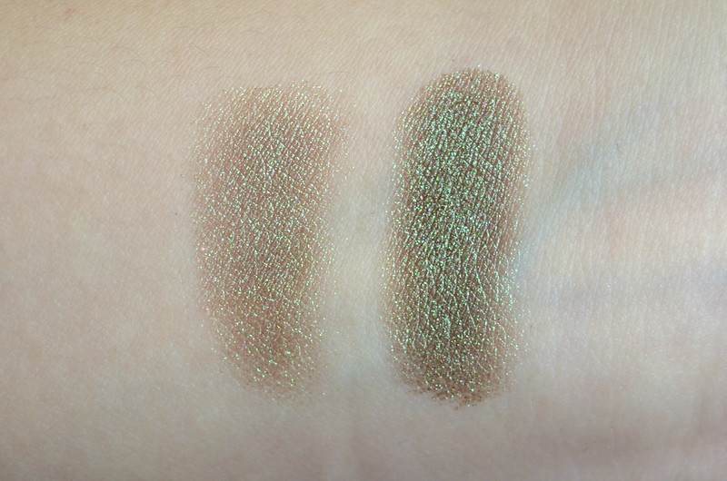
l-r: 1 swipe, 3 swipes
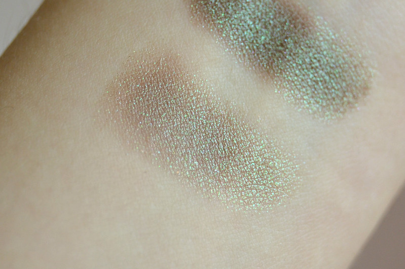
1 swipe
3 swipes

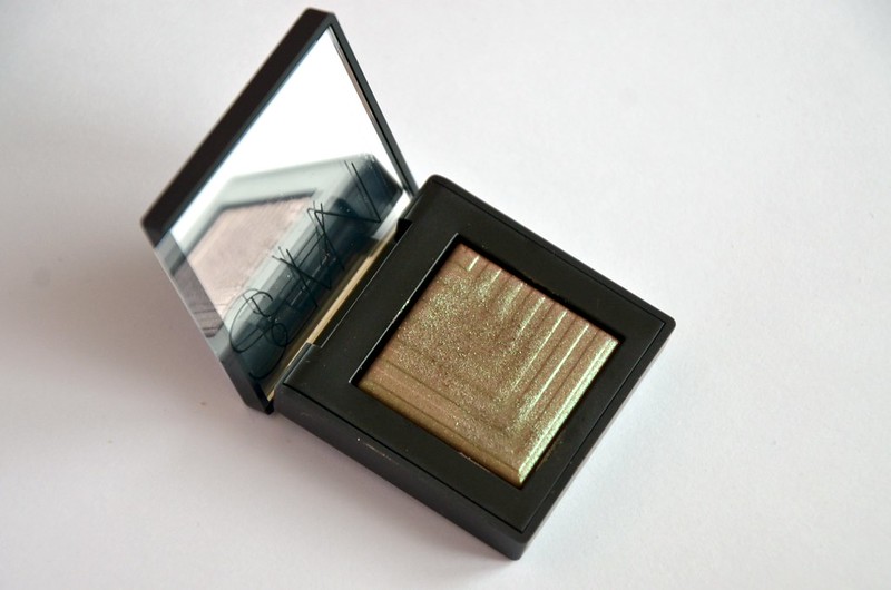
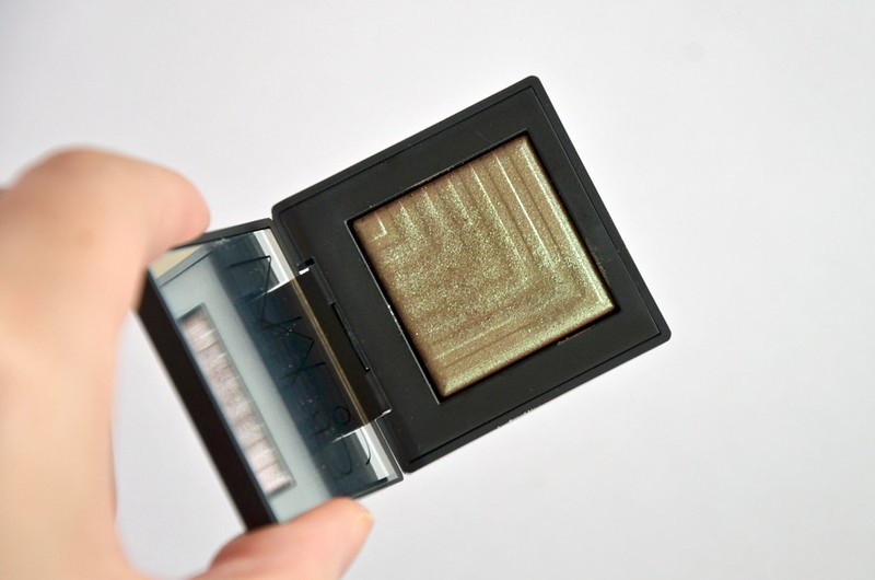
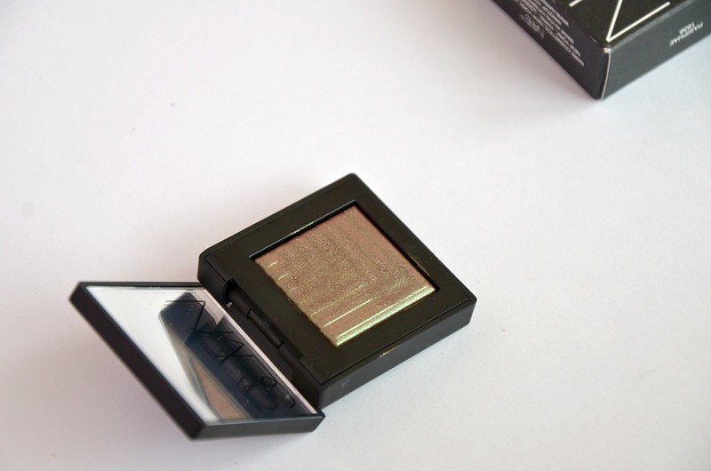
Released as part of the NARS Fall 2015 Collection, Pasiphae is described as a "shimmering peacock burgundy". I'm not sure what colour "peacock" is supposed to be, but I'm assuming a jewel-toned green. I've tried to capture in the photos the different shifts and dimensions of Pasiphae, depending on the angle and how much shadow is applied. With just one swipe, the warm brown base and the emerald green shimmer are evenly balanced. It's on the sheerer side, but super sparkly and eye-catching, with primarily gold, green, orange and diamond microglitter. When built up, it's more distinctly green overall but colour-shifting, ranging from a yellowy-green, emerald green, to a slightly plummy brown. Despite it passing for a duochrome, when actually applied on the lids, the colour doesn't shift that noticeably and is mainly a glimmering green.
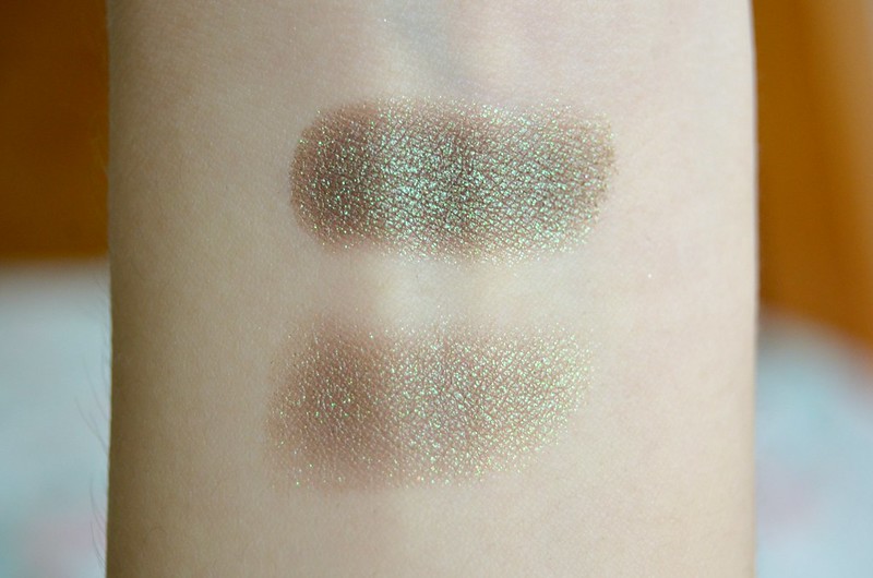
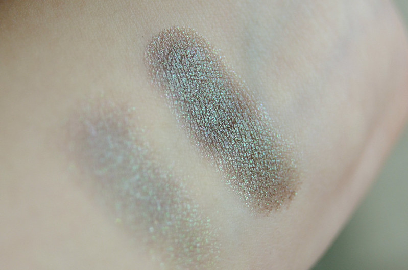
l-r: ColourPop So Quiche, NARS Pasiphae, Wet n Wild Definer (bottom right Comfort Zone palette)
l-r: ColourPop So Quiche, NARS Pasiphae, Wet n Wild Definer (bottom right Comfort Zone palette)
I don't have any dupes for Pasiphae, but I pulled out two eyeshadows that I thought would be close. ColourPop So Quiche has a similar glittery quality and predominately green colour, though the glitter is obviously different, being mainly purple and pink. The Definer shade at the bottom right of the Wet n Wild Comfort Zone palette is also a duochrome, except it's far more red in tone with a darker metallic teal shift, rather than the lighter greeny-gold and less pronounced brown base of Pasiphae.
Texture-wise, these are a drier formula, probably because they're designed to be used either wet or dry (I find the texture to be most similar to Tom Ford Eye Colour Quad in Emerald Lust, also formulated for wet or dry application). That's not to say they're not pigmented. Used dry, they are initially sheer (though the sparkle/glitter factor is strong), but can easily and quickly be built up for opaque colour. They're really smooth and easy to blend — the kind of eyeshadow that almost applies better with the fingers than brushes. I actually prefer that you can choose how you want to use the shadow to achieve the look you're after. You might want to only use this lightly, tapping it onto the lids with your finger over a coloured cream base, as more of a subtle gleam. Or, you might want to use it wet for maximum impact, patting it on the centre of the lid with a flat brush and grounding everything with a brown shade in the crease à la BeautyLifeMichelle.
It's an undeniably high quality product with a sophisticated take on shimmer, but my main problem is I'm not convinced it works for my sallow skin tone. If I have to wear colour, I generally get along well with greens (particularly of the khaki variety), but the effect of Pasiphae on me is very muddy, dull and complexion-draining. I don't know what it is, but every time I've experimented with it, I've come to the conclusion it simply isn't flattering. A lesson learnt to not buy something simply because it's cheap(er).


0 Comments